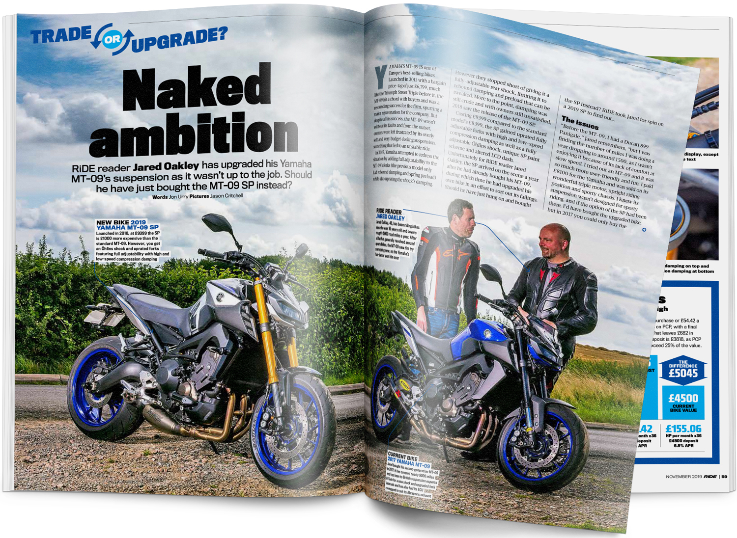
Here are some Motorcycle Double Page Spread Research
Based on my research, the double page spread for motorcycle magazine has conventions of using: a by line (person who wrote the article and the photographer), heading, subheading, image of a motorcycle in the middle, articles that are divided into small chuncks and not using much negative space as the double page is filled with an entire image, and page numbers, website, and magazine title.
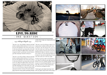
Here are a few sketches and pictures of possible double page spread ideas that I'm going to use for my magazine
5 Thumbnail Sketches
Reflection In the begining, I didn't really like the layout of my double page spread since it looked boring. However the addition of the drop cap, red text pull quote, and the change of colour of the heading made it seem more interesting. Then, when I was trying to experiement with the 1st picture, I spent about 30 mins developing it and I couldn't choose which double page should I use for my final magazine. I asked my friends and it was a tie vote so I decided to use a coin flip for which one I should use. Heads for the first picture and tails for the second picture. It landed on the tails. Next, I futher tidied it up while adding captions to the pictures. Also, I would've picked this either way because my teacher helped me with alligning the subheading and gave me feedback for it so I'll not let it go to waste. Finally, I end up with this design which I'm happy with since it looks organized and easy to read.


.png)


No comments:
Post a Comment