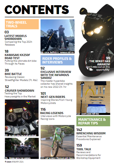
Here are some Motorcycle Contents Page Research

Based on my research, the contents page for motorcycle magazine has conventions of using headings that says 'Contents', columns, gaps between each title and description, have 4-5 images, banner to sepereat each section, have pages until the hundreds, captions with page numbers and not using a by line and pull quote.
Here are a few sketches and pictures of possible contents page ideas that I'm going to use for my magazine
5 Thumbnail Sketches
Sketch #1
Picture #1
Refining
Reflection: At first I thought puttiing the zx-14r motorcycle vertically on the right would look cool but after some feedback from my teacher and friends, they say that it doesn't look right (fit) and one of my friends suggested to turn the motorcycle horizontally and only show the face of the bike. With the addition of adjusting some lighting, contrast, and warmth of the picture, it seemed fitting to the content page and my teacher approved of it. I also add shadow at the bottom to make the motorcycle look alive and present in the page. When my teacher suggested to change the small picture on the bottom left, I was skeptical because I like it there but after I change it, I had a second thought and kept the changes. Also I had some difficulty to write down the captions because I was not sure what title to use for that picture such as the middle top one where I wrote 'local rapper' because he looks like one.


No comments:
Post a Comment