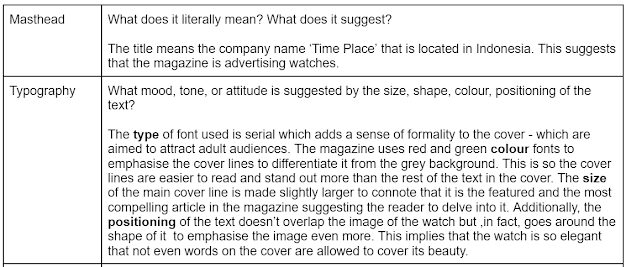
Here is my magazine research. Note that, at the begining I was researching all types of magazines but later on I research more on motorcycle magazines.
Magazines uses alot of effort to grab people's attention. The best place to be in a store is at eye level, and companies pay a lot for that specific spot. Since many magazines have similar titles, the magazine has to make its front cover the most attractive to get noticed. It's difficult because magazines are stacked on shelves, and only a small part of the cover (upper third or left third) is visible, This research helps me know where to put the most interesting and attention grabbing features on my magazine cover.
2 Big Detail Magazine Analysis
4 Small Detail Magazine Analysis
Starting off with the cover, while it is has a simple design and doesn't have any clutter, I don't like this cover because, personally, it doesn't hook the reader in anyway, it overall seems boring (appearance wise) and would get ignored if it was put on a magazine shelf. This dull looking cover would be targeted to older audiences (between the 40s-50s) since they would probably recognize the person and this is an example of what I don't want my magazine cover to be like. However, I believe the contents page has a good mix of words and pictures to show the audience a hint of what the article is going to be about so I would probably use this as inspiration for my final project. Lastly, the double page was well structured which makes it easy to follow and it doesn't make the article look bland - which I could implement in my magazine.
I like how the cover uses bright colours and how the typography fits perfectly with image to hook the reader's attention (space enthusiasts). It also emphasize on the large scaled word "space" to highlight the contents of the magazine directly. I could implement this by typing my target audience's interest and use all capital letters to increase the chances of them seeing my title and read my magazine. Next, is the contents page that is simple yet effective since it clearly stated the pages of each article and the overview of the magazine with the addition of pictures to not make the content page look boring - which I appriciate. Futhermore, I love the picture to words ratio in the telescope double page because I believe it's gives the reader the option and freedom to choose either only observing the pictures, or only to read the articles or even both. This is one of my favorite double page structures that I would use in my magazine final project.
Additional information: In my opinion. the 2 extra double pages (after the telecope) has cool looking pictures which can make the reader stay on that page just to admire the stunning images.
I like how the image in the cover is looking directly to the reader (fashion enthusiats that are females) . This can create a personal connection with them and the magazine which can increase the chances of them to read the magazine. I also like the use of the buzzword 'FREE' to hook the readers attention. However, in my opinion, I believe the model for the main image is covered abit too much by the text because I saw from previous female fashion magazines, the words and coverlines in the cover often follows the shape of the model and not cover the majority of their body. So that is something for me to take note off (how the image and text in the cover is positioned for the best attention grabbing strategy). Following that, there is nothing wrong in the contents page but in the double page, there is too much text with few pictures to compensate for it - which can lead to an increase in boredome for readers.
When my teacher gave me feedback about my magazine research, he said that I didn't have many motorcycle magazine research so here are some examples:
Examples of Motorcycle Magazine Covers
I love the main cover image here, it just hooks the readers attention entirely. I want implement this to my magazine cover.
This design is also an interesting one as it doesn't clutter the page too much and it's not too empty. I love the use of the colours red and yellow to make the reader focus on that first then shifting it to the other elements of the cover (pictures and coverlines). I want to implement the picture on the bottom right to my magazine.
Examples of Motorcycle Magazine Contents Page
Examples of Motorcycle Magazine Double Page
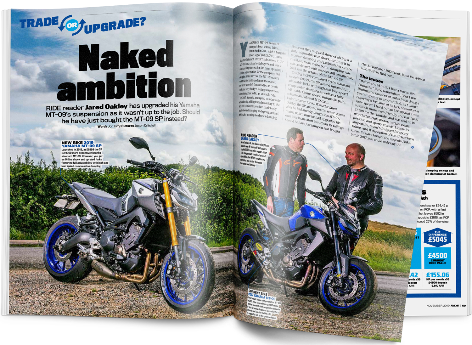
This is what a motorcycle double page spread looks like. With the motorbikes on the ground and the text/articles are on top in the sky.

This is what an interview in a motorcycle magazine would look like, I can implement this type of layout to my double page spread since I'm also doing an interview.
Here is a link to my Double Page Spread research + development
https://saka-regentsmedia.blogspot.com/2023/11/double-page-spread-research-development.html
Reflection
I learned that there are many aspects of the magazine such as masthead, coverlines, and main cover image and each feature has a specific function to attract a specific audience. From my research, I got to anaylse the different magazines and it's conventions on what it look like based on its genre. By knowing this, I get to use that knowledge and apply it to my final magazine project. I enjoy writing what I like and dislike about each magazines and how I apply it to my project because it is easy to do, while I don't like how time consuming it is. Also, at the begining, I was not sure what genre I wanted to choose for my magazine so I researched many different types. Then, I decided to choose the automobile genre (motorcycles) after some research and identifying my available recources that I have so that the production of my magazine is simpler.
I learned that there are many aspects of the magazine such as masthead, coverlines, and main cover image and each feature has a specific function to attract a specific audience. From my research, I got to anaylse the different magazines and it's conventions on what it look like based on its genre. By knowing this, I get to use that knowledge and apply it to my final magazine project. I enjoy writing what I like and dislike about each magazines and how I apply it to my project because it is easy to do, while I don't like how time consuming it is. Also, at the begining, I was not sure what genre I wanted to choose for my magazine so I researched many different types. Then, I decided to choose the automobile genre (motorcycles) after some research and identifying my available recources that I have so that the production of my magazine is simpler.


.jpg)


No comments:
Post a Comment